Houston Updates
-
Archive
- June 2025
- March 2025
- December 10, 2024
- September 14, 2024
- May 21, 2024
- March 19, 2024
- December 9, 2023
- June 16, 2023
- April 6, 2023
- March 17, 2023
- Dec. 19, 2022
- Sept. 14, 2022
- July 4, 2022
- March 27, 2022
- March 9, 2022
- September 2021
- April 2021
- March 2021
- September 2020
- August 2020
- June 2020
- April 2020
- March 2020
- January 2020
- December 2018
- June 2018
- March 2018
- February 2018
- January 2018
- September 2017
- September 2017 Post-Hurricane
- June 2017
- March 2017
- January 2017
- September 2016
- March 2016
- December 2015
- September 2015
- June 2015
- March 2015
- December 2014
- June 2014
- March 2014
- November 2013
- September 2013
The Economic Outlook for Houston in 2019: Oil Prices Are Up Again, But Oil Risk Continues
December 11, 2018
Houston’s economy struggled from 2015 to 2017, with its problems centered squarely on the price of oil. But this year growth turned robust, as we put low oil prices behind us, and the U.S. economy continued to grow. Our current story about Houston’s economy is simple: how Houston’s economy arrived at its present point, where it stands right now, and where it is headed over the next few years. That final part – where we are headed – still depends very much on oil prices.
- Houston just finished up three tough years between 2015 and 2017, a period of virtually no growth despite the strong U.S. economic expansion. The slowdown was entirely attributable to a major setback in oil markets.
- Today, we have turned the corner in oil markets, and Houston’s growth is back on a strong path. Reported jobs numbers have exaggerated Houston’s growth right now, but times have turned positive again in 2018.
- Going forward, the greatest uncertainty is still oil. We have a new and evolving fracking industry that has moved into the driver’s seat of the American oil industry. Frankly, it has not been a very cautious driver so far, spending cheap money far too freely. And the industry uses technology and employs people in new and different ways. Even in the current good times, this new American oil industry affects Houston’s economic growth in ways we have not seen before.
- Oil prices dipped back near $50 per barrel in recent weeks, but it seems likely that $60 can still prevail into 2019. U.S. sanctions on Iran proved to be a failure – at least where oil production and prices are concerned – and getting the Iranian oil production back in line with the U.S., Russia, and the Saudis will be the near-term challenge for global oil markets.
Houston Puts the Oil Bust Behind it
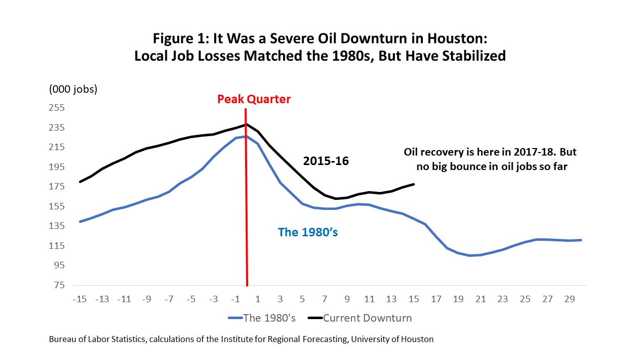
Let’s start with how we got here: Houston suffered through two years of no growth in 2015-16, and apart from Hurricane Harvey jobs, 2017 was quite weak. The slowdown stemmed from a single key factor: a fall in the price of oil and the loss of 74,000 local oil-related jobs.
Offsetting this were four big plusses: the U.S. economy rolled right on; we had built up tremendous momentum from the boom years, and it carried forward into 2015 and 2016; low natural gas prices brought a petrochemical boom to the Houston Ship Channel; and while Hurricane Harvey reconstruction was short-lived, it was a net plus for the economy in late 2017.
Despite a serious oil downturn, these four positive factors combined to keep us out of recession. The best cyclical measure is Houston’s Business Cycle Index (BCI) from the Dallas Fed, published for Texas and all its metro areas. The BCI is specifically designed to track the local business cycle, and is built on four variables: payroll employment, the unemployment rate, real sales taxes, and real income.
Current BCI data point to the local economy as having peaked in January 2015, then declined 1.6 percent through September 2016. This would be a milder downturn than the 3.1 percent decline Houston experienced during the Tech Bust/Enron recession, which was Houston’s mildest recession ever. It not remotely like the Great Recession (an 8.3 percent decline) or the 1980’s oil bust (17.6 percent).
If Houston’s overall economy navigated the fracking bust well, it was despite a brutal downturn in oil-related activity that mirrored the early years of the 1980s recession. (See Figure 1.) Measures matching or exceeding the 1980s bust was the rate of decline of the rig count, the historic low level reached by the rig count in 2016, and the loss of oil-industry capital spending. Houston’s 2017-18 recovery in oil jobs shows no big bounce back so far, a subject we will return to at some length.
On the positive side of the ledger, momentum from the oil-boom continued to carry the local economy forward through 2015-16, even as the oil industry contracted. Figure 2 provides a measure of this forward momentum. It contains a list of nine service industries in Houston that account for about half of the 3 million jobs in the metropolitan area. These industries are not drivers of the economy but jobs that grow in response to big gains elsewhere in the economy, from oil or sectors driven by U.S. economic growth.
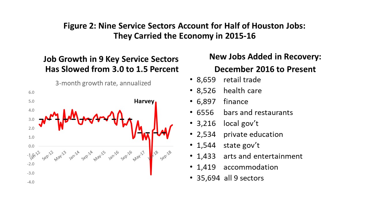
During the boom years from 2012 to 2014, Houston added 100,000 new jobs per year, with as many as 100,000 net in-migrants. And after the fracking boom ended, we still had a lot of catching up to do. We needed new roads, hospitals, shopping malls, schools, … etc. The catch-up jobs in these secondary sectors grew at a 3 percent annual pace in 2015 and 2016 – still matching the boom years – before they slowed in 2017. They are now growing at only 1.5 percent, or half the previous pace.
The boom in petrochemicals on the Ship Channel was set up by a 2013 collapse in natural gas prices. An emerging long-term surplus of domestic natural gas made it available for export as LNG, or as a cheap feedstock to make plastics such as polyethylene and polyvinyl chloride. Cheap gas triggered huge capital investments on the scale of $220 billion nationwide, with perhaps $150 billion on the Gulf Coast and $50-$60 billion in Houston.
The first wave of natural gas-driven construction peaked in 2017, and most of the largest plants have finished up. There are still many big projects that are either underway or proposed, including a possible new refinery in Houston. But the big first round is over, and new projects will never offset what has already been completed. Winding down these projects leaves us with a mild drag on local economic growth.
The final item on our list of positive impacts on the economy is Hurricane Harvey. Hurricanes can do enormous physical damage, with $125 billion in storm-wide losses for Harvey that must be written off the balance sheet. However, the flow of income, employment and production – variables that serve as our measures of economic activity – usually net out to a small positive or negative. A brief period of shelter from the storm, and economic losses as stores and plants close, is offset after the storm by a mini-boom in construction and retail.
This small plus or minus for the economy is the typical story for large hurricanes – the academic literature is full of academic articles on Florida, Georgia, the Carolinas, etc. Our own study of eight storms in Houston dating back to Alicia in 1983, confirms that we are big no exception.
There are two main points to be made. First, Harvey was a small plus for the economy – about a one percent increase in payrolls or roughly 30,000 jobs in late 2017. This number is bigger than any other Houston storm we have tracked. Second, a hurricane-related economic surge in jobs is typically over in six months, when the big impacts disappear. This rule of a six-month limit on economic impact seems to apply to all past Houston storms, including Harvey in late 2017.
There are exceptions to every rule, including the idea that major storms having a small and short-lived economic impact on the economy. Exceptions include Katrina in New Orleans, Maria in Puerto Rico, and Galveston in either 1900 or after Ike in 2008. Our rule has to be qualified by the need for adequate infrastructure to handle flooding and storm surge. New Orleans’ levy system being overcome, the electrical system failure in Puerto Rico, and storm surge overwhelming Galveston’s seawall all count as infrastructure failures.
Harvey’s lasting legacy will be the many measures being taken to improve local storm protection in response to Harvey and other recent storms. Harris County is issuing $2.5 billion in bonds, and well over $125 billion is being made available for disaster relief to be divided among California, Puerto Rico, Florida, Louisiana, and Harvey-damaged Texas – including the Houston area. See Figure 3.
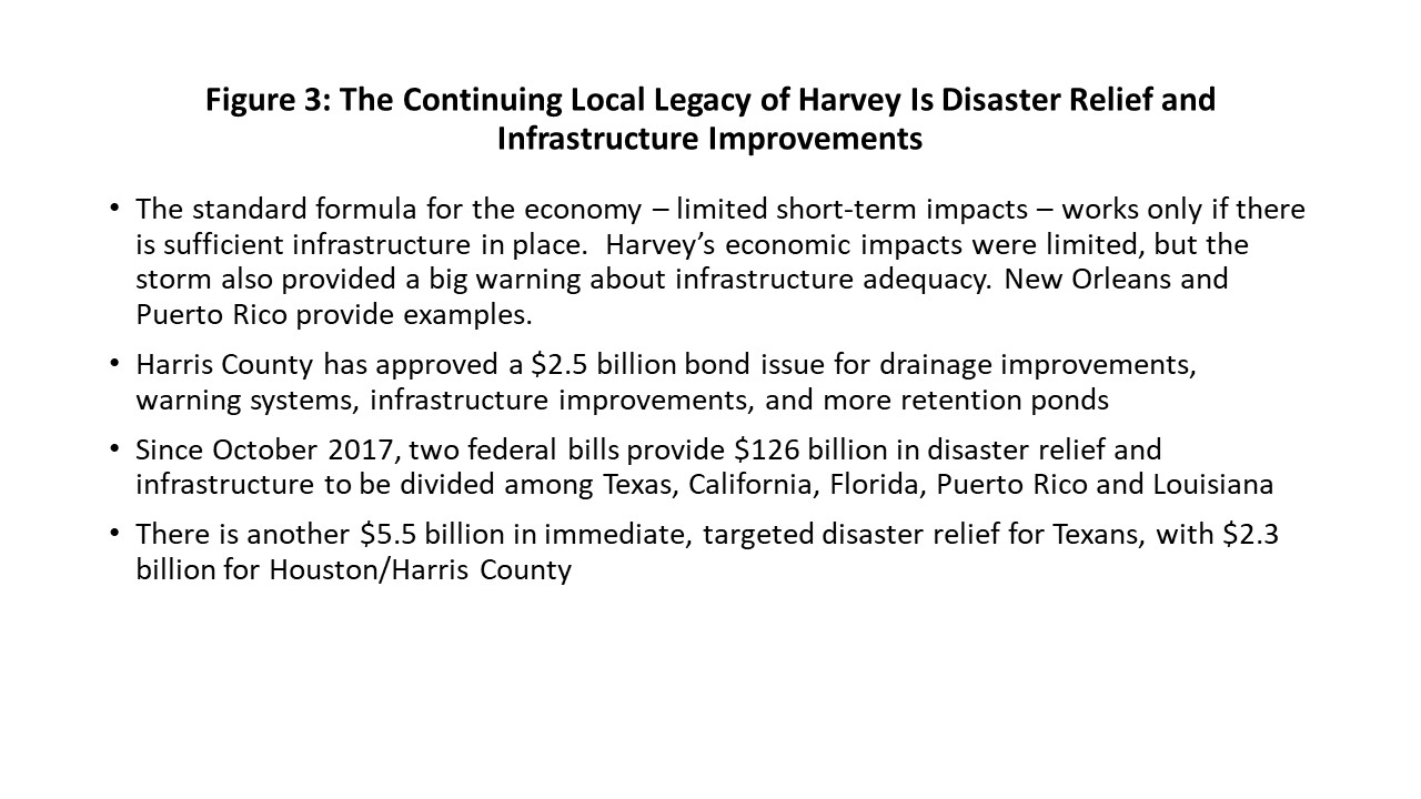
This infrastructure construction is a plus for the economy – much like a new refinery or chemical plant under construction – but any cyclical impacts will come slowly and over a prolonged period of time. The projects are important long-term insurance to protect the Houston-area balance sheet, as well as the local economy. But it is not a game-changing event for the local business cycle.
Where Is the Houston Economy Today?
The monthly payroll employment report is the most timely, comprehensive and detailed data that we receive on the Houston economy. It also provides a comprehensive and trustworthy history of job growth. As we will see, the initial estimates of local job growth can be flawed, but as we work through many months of accumulated administrative records that support revisions, we ultimately arrive at solid data.
The initial monthly payroll estimates from the Texas Workforce Commission (TWC) are based on a relatively small sample of employers. They estimate the numbers of workers in Houston eligible for unemployment insurance. Administrative records slowly become available over 24-36 months and provide a comprehensive count of Houston’s payroll jobs.
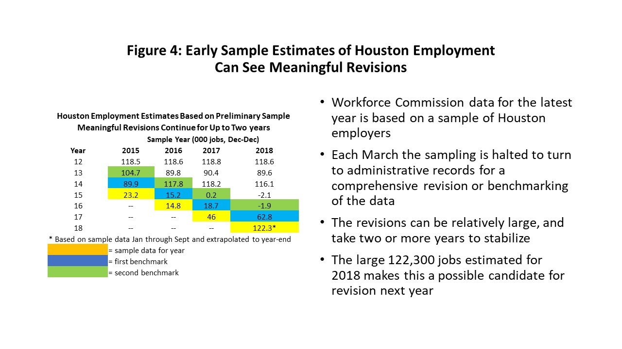
Figure 4 provides some examples of how revisions have occurred in past years. For example, as you look across the chart by line in 2013, the initial estimate of 104,700 was revised down to near 90,000; 2014 was revised up to about 116,000; and 2015 was successively revised down from 23,200 to 15,200 to -2,100. We can point to much bigger changes in Houston’s history. But the point is not about the TWC making an error – it about understanding the limits of their initial sample and how their systematic revisions will ultimately get us to the right place.
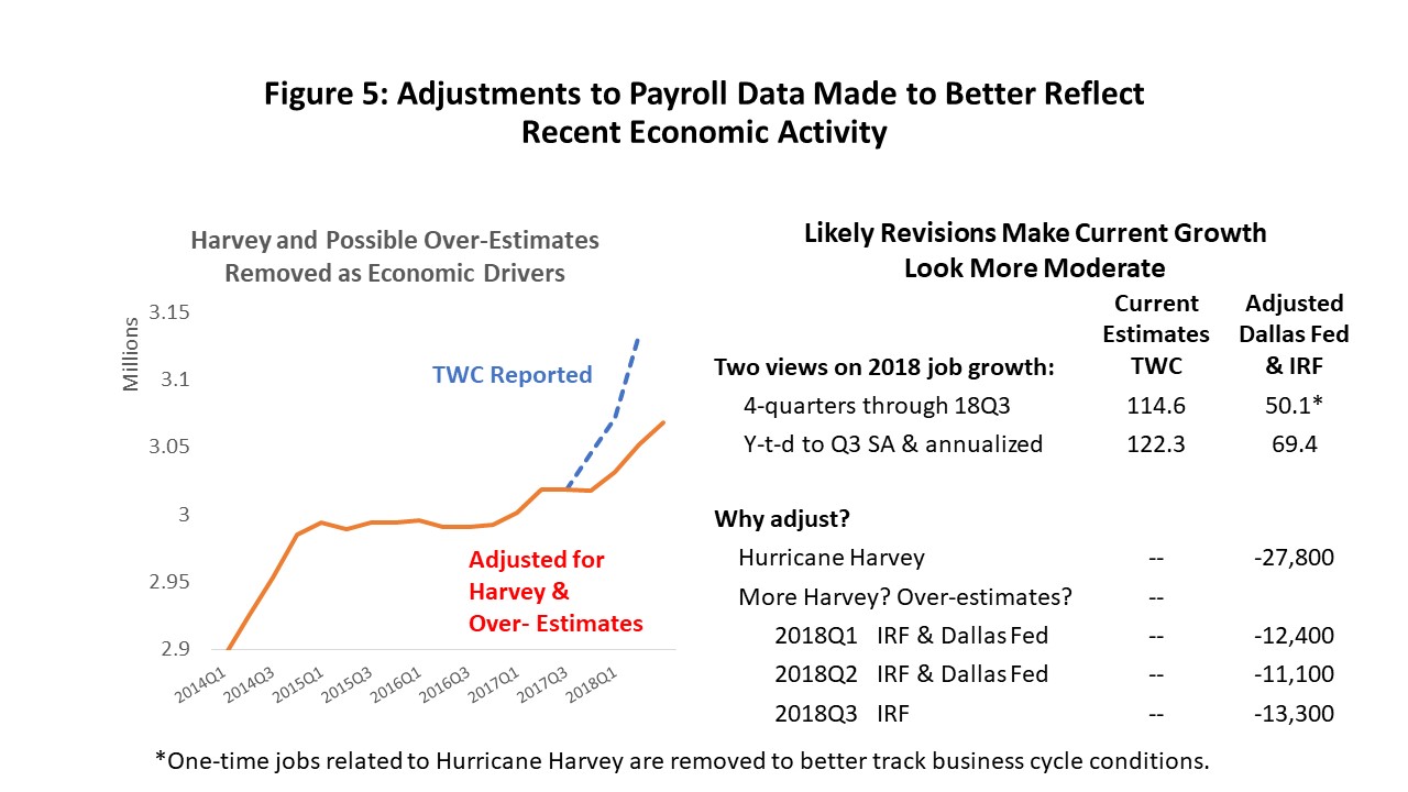
If we extrapolate TWC’s estimate of 2018 payroll employment for the first nine months to the end of this year, we would gain 122,300 jobs. This seems very high, bigger than any year of the fracking boom, and I think there are many good reasons to be skeptical of this figure.
- A deep recession often brings big job losses and a big rebound in employment in response. But Houston had no significant decline in employment or the overall economy. No such “recovery’ is called for.
- We had a deep recession in the oil sector, but even here the rebound has been positive but relatively subdued. The response has been to $65 oil, and it looks nothing like the big oil-related gains made when oil was $100.
- We saw above that nine service industries make up half the local economy, and collectively they are growing at 1.5 percent annual rates – not 4.1 percent like the 2018 projected estimate of total employment.
- Hurricane Harvey brought close to 30,000 one-time, temporary jobs in late 2017. Our six-month rule says they should not be a driver of the 2018 job numbers.
- The Federal Reserve Bank of Dallas does preliminary revisions based on administrative records – revisions that are done timelier than the Workforce Commission. They show substantial cuts to the current 2018Q1 and Q2 sample estimates.
What is a better figure for job growth? I will save you all the details, but I made a guess that is summarized in Figure 5.
- There are two factors at play here. First, we need to take Harvey jobs out of any calculation of the future. Yes, the jobs counted in 2017, but they did not affect 2018. Harvey was a one-time event that has no bearing on the business cycle last year or this year beyond a brief period of reconstruction. I have removed the 27,800 Harvey jobs in 2017Q4 to improve our perspective on how the business cycle unfolded.
- Second, based on the Dallas Fed revisions, I have moved 2018Q1 down by 12,400 jobs, and 2018Q2 by 11,100. The Houston employment model agreed closely with these revisions, and also says to reduce the 2018Q3 figures by a similar amount. No Harvey jobs are at work here: these are just over-estimates from the sample.
- The bottom line is that for 2018 we estimate 69,400 jobs. It is the adjusted TWC figures plus revisions for the first three quarters of 2018 extrapolated to year-end. This is a good number, with 69,000 jobs better than the average year in Houston since 1990. Tt marks the return of meaningful job growth to Houston for the first time since 2014, and it deserves to be celebrated even if it falls short of 122,300.
There is much Houston data available beyond payroll employment. We can turn to many other sources to tell similar stories about Houston’s economy. Figure 6 shows the Houston Purchasing Managers’ Index, for example, which is set at 50 to mark the no-growth line. Greater than 50 indicates expansion, and less than 50 is contraction.
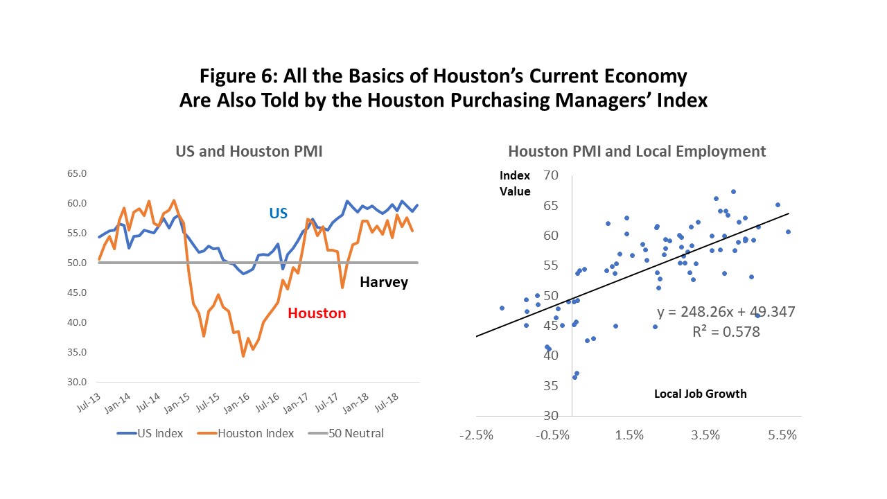
The PMI tells us the same business cycle story as the payroll data: the oil downturn of 2015-17, the aborted oil recovery in 2017, the effects of Harvey on the economy, and now the oil recovery underway in 2018.
The scatterplot at right tells us there is a very strong and statistically meaningful relationship between the PMI and local payroll employment. Unfortunately, there is too much random noise in the relationship to make it possible to discriminate between 70,000 and 120,000 jobs in 2018.
Houston’s unemployment rate (Figure 7) does not provide detail about its recent business cycle, but it certainly points to weakness during the oil bust compared to the rest of the country. As oil prices declined, the local unemployment rate rose and then fell back as the economy expanded. We are still trying to catch up with the U.S. unemployment rate, which has moved to five-decade lows that are below four percent.
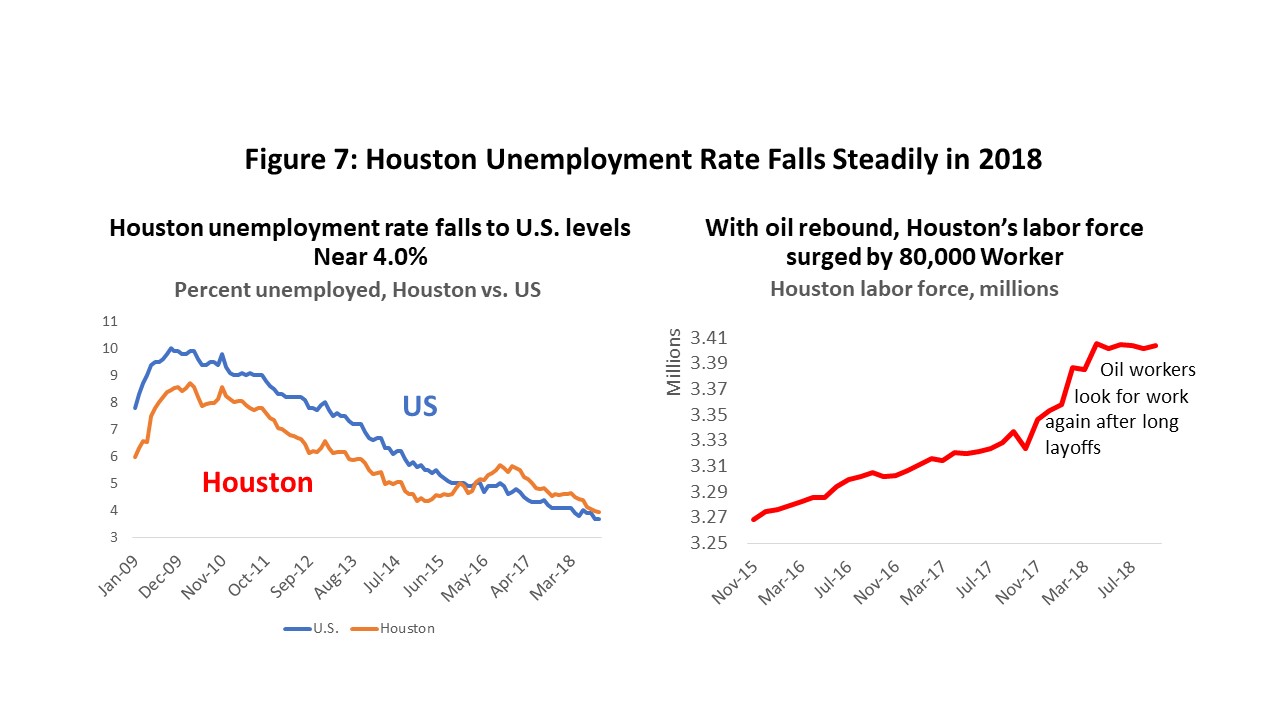
The chart on the right side of Figure 7 is another positive story about local economic recovery. As soon as oil-industry hiring began in earnest in late 2017, we saw nearly 80,000 workers return to the labor force, many of them seeking work after long layoffs.
To be part of the labor force, you must be actively seeking work. Many oil workers, for example, were laid off and without work for many months, but not “unemployed” because they were not actively looking for work. They knew in 2015-16, for example, that oil-related work was not available in Houston – why look? But as word got out that hiring was again underway, they flocked back to the labor force in earnest. Despite the long layoffs, there are apparently plenty of local workers still available for work, and now actively looking.
How many oil workers?
So far, Houston has not seen a strong recovery in oil-related employment. Of the 74,300 oil-related jobs lost since 2014, only about 20 percent have returned. They are coming back more slowly than they were laid off, and more slowly than they were hired in 2012-14. In part, these jobs are lagging because oil-price is $65 per barrel, not $100 as in 2014, but we also know that other important factors are at work.
For example, fracking is driving the U.S. oil industry today, and it brings a new approach to drilling. There are also major technological innovations rapidly reshaping the drilling industry. We hear stories every day about oil workers in the field that are being displaced by these changes, even as drilling responds to higher oil prices.
But what about Houston? We are the technological heart of the industry, a major engineering and manufacturing center, but with virtually no local drilling activity. Are our local employment prospects better than workers in the field? Or worse? The answer matters a lot as we think about the future relationship between oil and the Houston economy.
All the action in terms of job losses or gains in 2015-16 was in the upstream, with losses widely shared by producers, oil services, machinery and fabricated metals. Among this group, only producers have failed to share in the upstream recovery. Downstream employment hardly ever moves much. Construction jobs – as we have seen – have been an important driver of activity in the Ship Channel industries, but they are not a permanent fixture of the industry. The occasional construction boom is large, but it comes and goes every decade or two, usually with a major shift in the price of oil and natural gas. We focus on upstream activity.
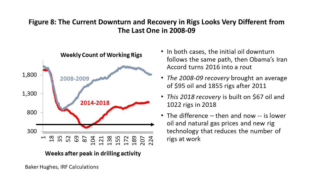
Figure 8 shows the Baker Hughes rig count, and its behavior after the last two times it peaked in the drilling cycles of 2008 and 2014. The downturn after 2014 was quite long and deep. You can see the crash of the rig count to its lowest-ever level in May 2016. Then for a few months we entered one of the fastest recoveries in the history of the rig count, partly because when you fall as far and fast as we did in 2015-16 the recovery is initially easy, as oil prices rise and personnel and equipment quickly return to work.
Unfortunately, this recovery was also helped by too much cheap money, and U.S. oil production returned far too quickly with help from private equity and high-yield finance. As a result of U.S. over-production, the price of oil quietly slipped back to $45 per barrel in May 2017. The latest 2018 OPEC/Russia effort to stabilize oil prices at $65 per barrel began in early 2018 and left us in our current position of 1050 working rigs. This falls far short of the 1,900 rigs working at the last peak.
Why is the rig count so much lower? First, it is a response to $65 oil price, not $100 as in 2014. Second, innovation and new rig technology continues to reduce the number of rigs needed to do the same amount of work. The oil service companies tell us that a fleet comprised of all modern rigs might ultimately have only 1,000 active rigs.
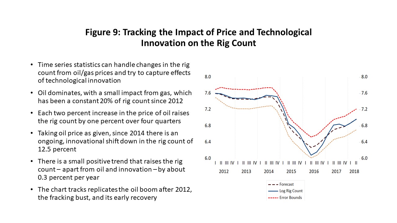
It is possible to use time series statistics to estimate how the rig count should change in response to price and technological innovation. The estimation process is relatively unsophisticated (oil and gas prices, dummy variables, innovational dummies, trends) but it still seems to work well.
The chart in Figure 9 “forecasts” the rig count using such a model. In this example, the data is stopped in 2012, and then forecast through the period of the fracking bust and recovery. The actual rig count is the solid line, and the broken line is the forecast.
The forecast works well except at two points (2016Q2 and 2017Q2), and both times is fair to say that the outlook was run off the road by oil-industry financing -- a credit crunch in 2016 and a renewed intoxication with high-yield bonds and private equity in 2017. But it also says we now have come back to the right level of the rig count, and in response to oil near $65 from spring to late fall.
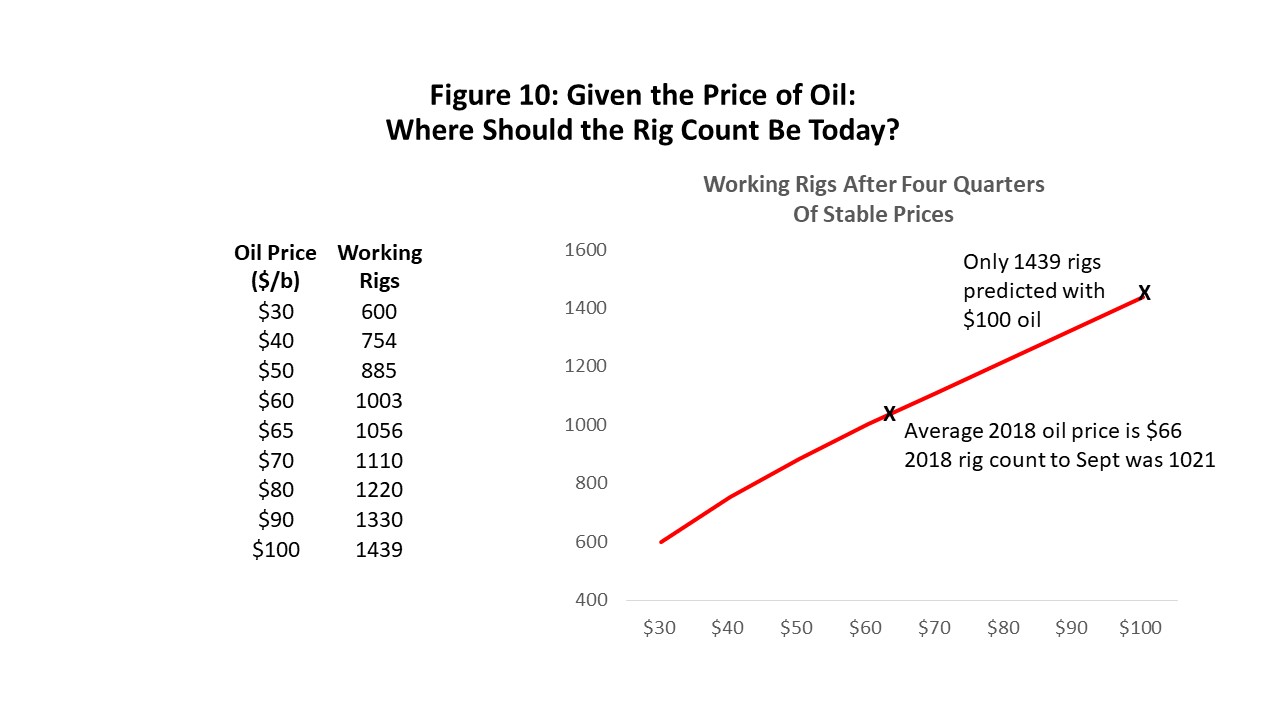
Using this model of price and innovation, the chart in Figure 10 tells what the modern rig count should be based on various oil prices and technology as implemented today. For example, in 2014, the rig count was 1900 and the oil price at $100 per barrel. Today, $100 oil brings 1439 rigs, or about 24% fewer. Today’s rigs count with oil at $65 per barrel is about where it should be – near 1056.
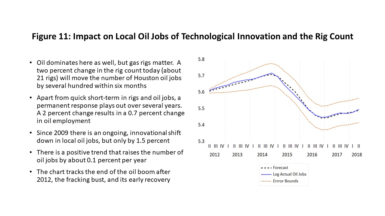
The more important question is not about rigs, but about how many oil workers we need in Houston. We used a model of price and innovation similar to that used for rigs but applied to determine how the number of working rigs affects the need for local producers, oil services, machinery, or fabricated metal. Again, we can ask this new model to reproduce the number of workers employed through the oil bust and recovery; the co-movement of the solid line (history) and the broken line (forecast) says it works well. (See Figure 11) The model allows us to produce a chart like Figure 12, relating local oil employment to the rig count and oil prices.
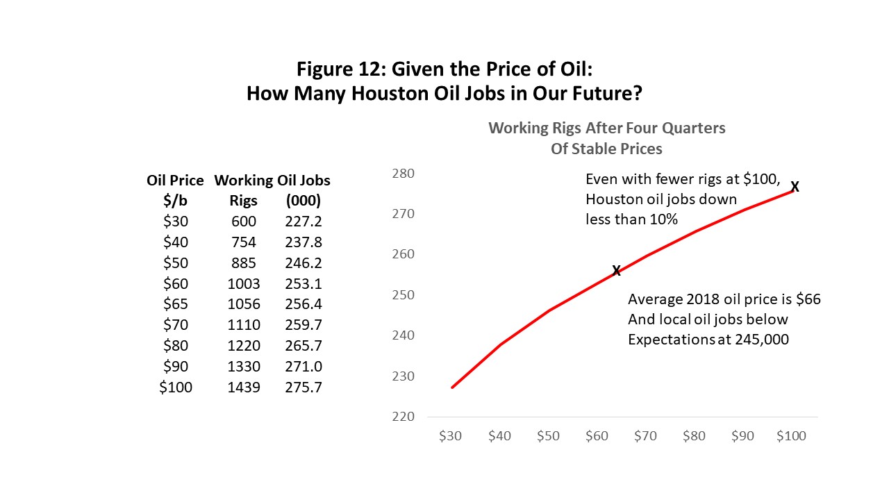
We estimated earlier that we need 24% fewer rigs today at $100 oil price than we needed in 2014, but the chart in Figure 12 indicates that at $100, we would need only 8% fewer Houston-based oil workers. At the current oil price of $65, we need 255,000, a figure that stands just below the level in November of this year. The decline in the need for Houston-based oil workers is not nearly as far as the fall in the rig count. How does this work? First, remember that we don’t drill for oil here in Houston, and we don’t employ many rigs. But we design, engineer and manufacture those rigs.
Second, Baker Hughes has long recognized that the number of rigs working has become an inadequate measure of drilling activity. Improved measures have been offered, such as the number of wells drilled or industrywide horsepower, but neither of these have a long enough history to capture and understand how technology and oil prices affect them.
The modern rig has certainly changed. These rigs now drill long horizontal well bores and drill multiple wells from the same site. They can “walk” from one drilling pad to another, have advanced automation that uses fewer workers on the site, and advanced communications that give the engineering center (often located in Houston) day-to-day control of operations.
The modern rigs are also huge, cost $25 million, and take 50,000 man-hours to design and build. These rigs place higher demands on Houston-based engineering, machinery, and fabricated metals than any built before. The outcome is simply more Houston workers per advanced rig – resulting in positive news for Houston’s long-term employment outlook. Just as we saw earlier that large numbers of oil-related workers are still active in Houston’s labor force (Figure 7), now we know for sure that there is also an on-going need for them despite lower oil prices and on-going technology gains.
The Price of Oil
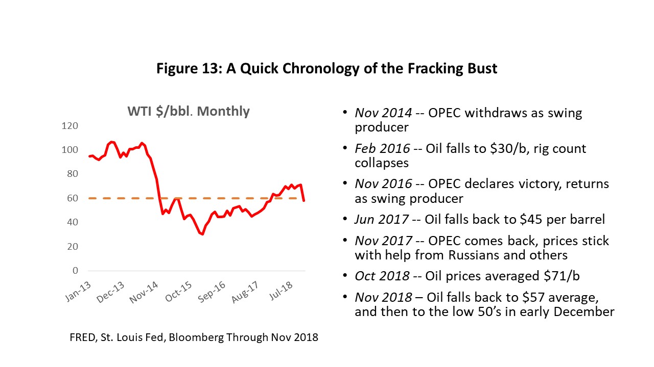
Figure 13 provides a short summary of the recent oil bust. Most relevant today is the return of OPEC as swing producer in 2016, after announcing it had successfully crushed high-cost American fracking. The claim proved premature, however, as oil prices fell back to $45 by May of 2017. But by early 2018 the Saudis had oil prices back on track, after convincing a dozen non-OPEC producers to join their quota system. Most important were the Russians, and this OPEC+ contingent kept price in the $65 range through October. Then price suddenly weakened in November, falling to near $50 per barrel in early December, reminding us once again that oil-market risk is always with us.
The near-term demand for oil remains on firm ground. The October IMF forecast for global growth indicates a small pullback in expectations, but from previous high levels. The long-term trend for world GDP is 3.7 percent, and 2018 should finish just above that at 3.8%. Next year sees global growth peak, and the outlook falls back to 3.4 percent. The developed world continues to perform well, led by a U.S. economy that was helped by late-cycle economic stimulus, while Europe and Japan have slowed slightly.
Growing concerns about emerging markets stem from several negatives that come together to potentially slow growth: a strong dollar, higher oil prices, rising U.S. interest rates, tariff and trade tension, and capital outflows. Even so, the global forecast comes together to provide a solid underpinning for oil markets.
Longer-term concerns about peak oil demand or peak supply play no role over our forecast horizon of five years. Nor are they likely to play much of a role over longer periods of time. Since 1990, the average annual increase in the demand for oil has been about 1.4 million barrels per day, a figure that ticks off year after year at a very steady rate. This year marks the point where global oil demand will probably pass the mark of 100 million barrels per day.
Adding to the recent level of oil prices was the return of political risk and supply disruptions, factors that have been absent from global oil markets since 2014. Venezuelan oil production, for example, has collapsed along with that country’s economy and is subtracting supplies of at least a million barrels per day. Mexico and Libya face smaller but continued longer-term declines in oil production. Political risk has put the Middle East in play: the Kurds and Turks face off in Iraq, the U.S. and Russians tied up in Syria, and the Saudis continue bombing Yemen.
Perhaps the key factor from May to October of this year was the restoration of prior economic sanctions on Iran, which could have disrupted as much as 2.7 million barrels per day of Iranian oil exports. Initially it was thought that sanctions would have no significant impact on Iran exports. France, the UK, Germany, China, and the U.N. vigorously oppose new sanctions. Russia, Turkey, and India were probably not going along anyway. In the event some Iranian oil production was lost, several oil producers quickly lined up to take Iran’s place as suppliers.
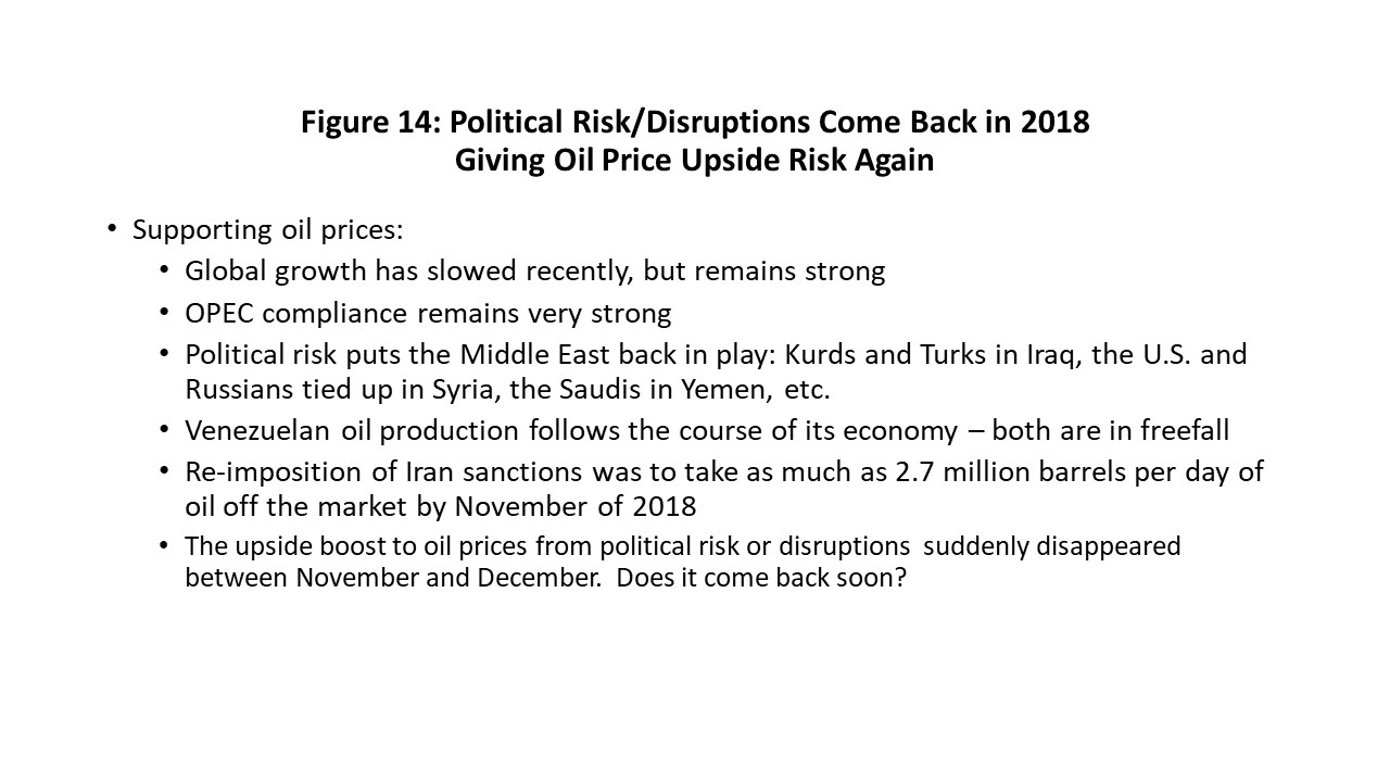
But the U.S. took a very tough approach, threatening shippers, airlines, oil companies, banks, and others. Europe found it hard to keep their companies from giving in to U.S. pressure. But in September, the Chicago Mercantile Exchange claimed Iranian production had fallen only from 3.87 million barrels per day to 3.80 million, mainly due to “ghost shipments” of contraband oil to Russia and Iraq. Others claim much bigger declines in Iran oil exports occurred, but it apparently will not matter. First, in the wake of the killing of a U.S.-based journalist, the Saudis offered to fill any supply gap left by Iran. Second, on November 2, the Trump administration offered waivers to a number of countries allowing the purchase of Iranian oil. Oil prices immediately fell to the low 50’s by early December.
Figure 15 is the forward price curve for crude oil, and it shows how quickly political risk can get squeezed out of the oil market. The curve normally slopes up and to the right, and the downward slope seen in October was a measure of short-term risk. With the October price averaging $71 per barrel, and the price two years in the future about $60, that difference of $10 is a measure of the built-in risk.
As risk is squeezed out, the near-term values on the curve should fall to lower price levels and its slope flatten out. Four curves show this pattern for four dates: October 19 at the peak of concern about the journalist being killed; October 30 when the Saudis agreed to make up for any Iranian shortages; November 2 was after the U.S. offered waivers to various countries to keep buying Iranian oil; and the latest reading on December 4 shows a flat curve with price at $54. They illustrate how quickly headline risk can evaporate.
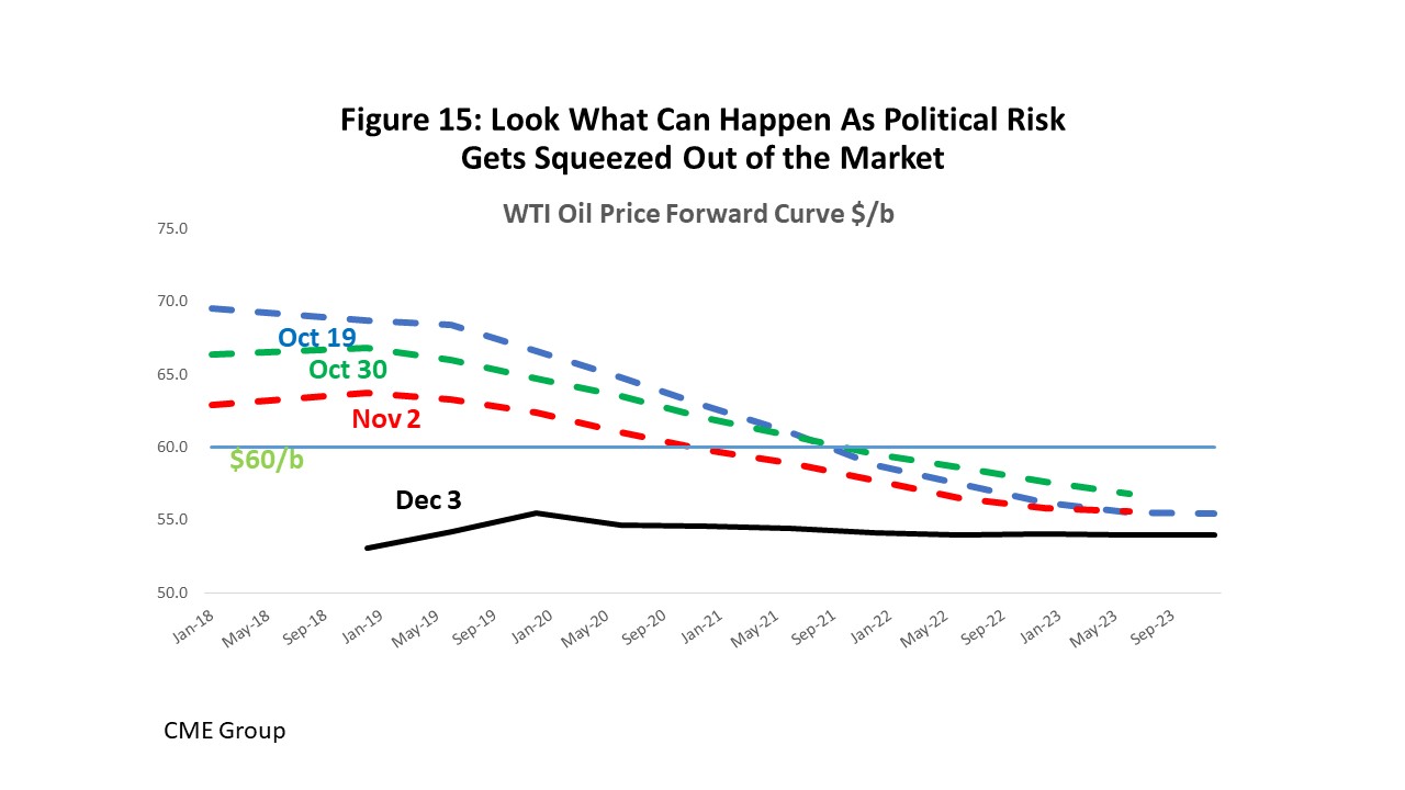
The December 3 futures curve is the best forecast of oil prices available right now. It is good enough to beat the models, analysts, and government agencies. But not good enough to be useful past just a few months at most. There is too much volatility and too many variables at play to count on this forecast remaining useful very long.
The OPEC meeting on December 6-7 did little to move the December 3 curve. Despite OPEC’s promise to remove 1.2 million barrels per day from the market, there was little immediate price reaction. Perhaps greater cuts were expected by the market than OPEC was able to deliver.
The American Oil Industry: World’s Biggest Producer
Let’s put aside the political risk and talk about where we stand on oil-market fundamentals, and where North American prices and production might be headed once we put any turmoil aside. The first point is that the price of oil should be about $60-$65 per barrel. It is the long-run marginal cost of oil in the United States.
Engineers will define the long-run marginal cost curve by lining up all the ways we can produce oil from different reservoirs and arrange them up from least to most expensive: Onshore Middle East, Offshore Shelf, Heavy Oil, Onshore Russia, …, and on to U.S. Shale, Canadian Oil Sands, and the Arctic. Shales and oil sands are the newest and most expensive of practical alternatives with a cost of $60-$65 per barrel.
Alternatively, an oil producer’s primary asset is their reserves in the ground, and potential investors must appraise the value of that company – and the price of oil -- before investing. Goldman Sachs each week solves the problem backward, asking what oil price assumption is being built into the current stock price of 40 producers. This provides another measure of long-term, forward-looking oil prices. See Figure 16.
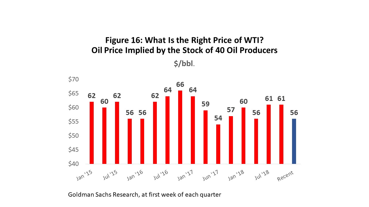
Since 2015, the Goldman Sachs measure of WTI price has consistently been between $55 and $65, averaging about $60. This matches the engineering definition of marginal cost, and is also the average, inflation-adjusted price of WTI since 1990. It is the price that is not too high and not too low, and the price that should deliver the right amount of oil over the long run, keeping both oil markets and Houston ‘s economy stable.
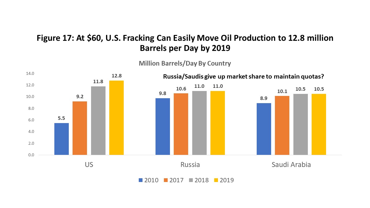
Figure 17 shows that the U.S. is back in the major leagues as an oil producer. Russia, the U.S. and the Saudis are the three top global producers. The Saudis and Russians are holding oil off the market now to keep price high, and as U.S. production rises, they must give up market share to keep prices stable. The numbers shown in Figure 17 are official production quotas. In the face of a tight market and solid oil prices, occasionally yielding market share may seem relatively painless.
As U.S. oil production continues to be revised up, however, when does it begin to pain the Russians and Saudis that the U.S. is steadily and certainly stealing their market? A recent test of the ability of these three countries to manage this problem was the return of Iranian sanctions, and ultimately the realization that large quantities of Iranian oil production would remain in the market. It was not a successful test. The Russians were cheating on their quotas by allowing Iran to secretly sell its sanctioned oil through an Indian refinery; the Saudi’s were over-anxious to replace Iranian oil exports in other markets; meanwhile, the U.S. continued to produce full out. This explains much about the current $52 oil price.
It is shale production – and a $60 oil price – that has facilitated the remarkable return to primacy of American oil? The economics of the shale revolution set it well apart from conventional oil exploration and production. In contrast to the oligopolistic markets of Shell, Exxon, BP, and the other giant national oil companies, fracking looks and behaves like a highly competitive industry: numerous small firms, low barriers to entry, and production that can be quickly ramped up or down as price changes. Unlike conventional oil, fracking has no significant exploration risk, makes output relatively certain, and works like an assembly line.
But there is also a history of bad behavior by American fracking, based largely on too much cheap money from central banks. Since 2008, U.S. producers too often leveraged their companies and outspent cash flows, facilitated by private equity and high-yield funds that put few limits on available cash. The result was over-production, low oil prices, and little or no profits for the companies themselves.
The brakes were partly applied on this behavior in 2018, with the bigger public companies that are followed by the stock analysts promising newfound discipline. They have generally complied with this commitment. The problem is that the modern fracking industry is highly competitive, comprised of many small private companies, and there are few barriers to many more private companies entering the fracking business. The big question is whether the rapidly growing number of private companies will also show discipline – or will they over-spend and force the entire industry to re-learn earlier lessons about cheap money, too much capital, and over-production of oil?
Surging U.S. production may be the greatest risk to stable oil markets over the next few years. The hockey stick on the left side of Figure 18 reflects a turnaround in U.S. oil production from a daily 5 million b/d to over 11 million – reversing nearly 40 years of decline that ended about 2009.
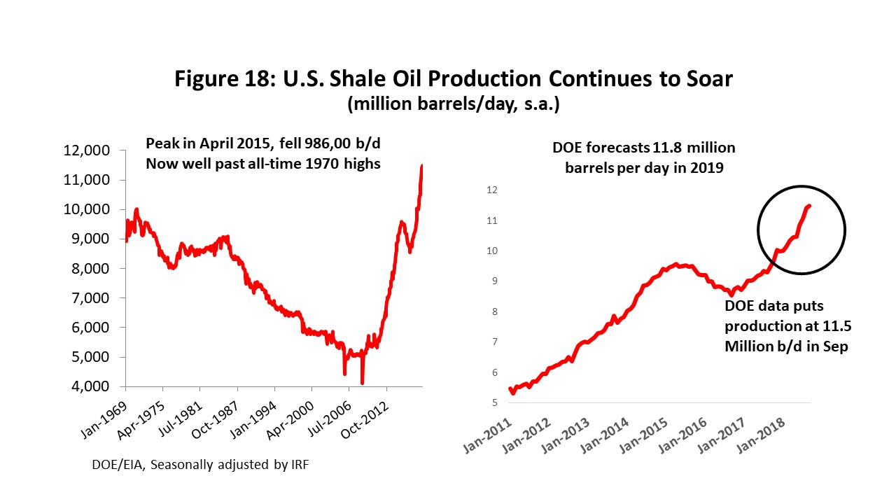
Figure 18 also makes the point that OPEC’s efforts to crush American fracking have been an abject failure. As the swing producer in 2015-16, U.S. fracking did not fill the role well, certainly not if OPEC expected U.S. production to quickly react to low prices, allowing large and speedy downward adjustments in supply. It took 18 months for American production to fall 990,000 barrels per day.
And as soon as OPEC returned as swing producer in 2016, promising higher oil prices, U.S. oil production began to grow again. It has now moved past the Dec 1970 all-time high level of U.S. oil production, and the latest September figure stands at 11.5 million barrels per day and rising.
Looking forward, maintaining high oil prices becomes even more of a challenge. Lagging Venezuelan oil production can be fixed in a matter of months with repair and maintenance. Like Venezuela, longer-term production problems in Mexico, Libya and Nigeria rest in the hands of these countries. U.S. fracking continues to soar, and some point the clash between U.S. production and Russian/Saudi market share must come to a head again.
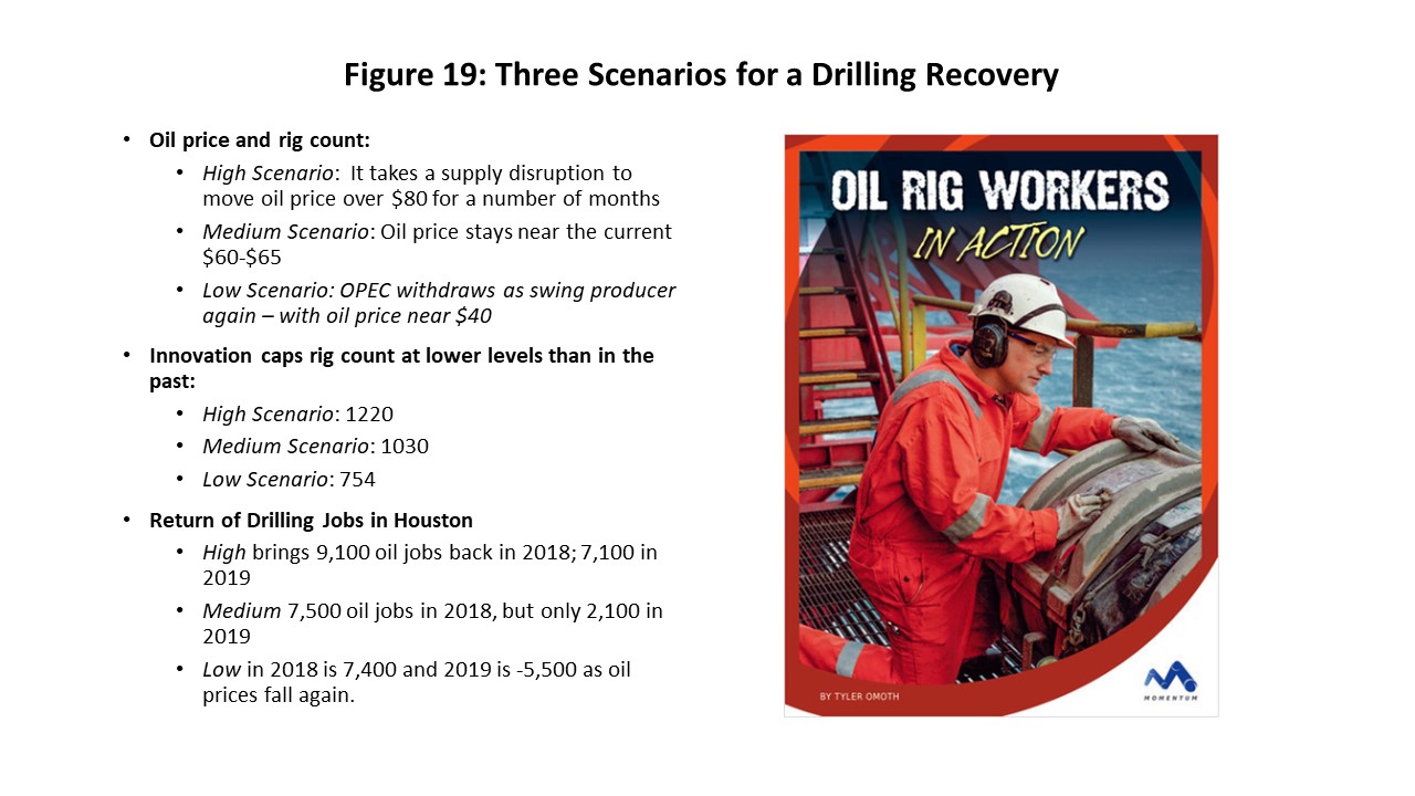
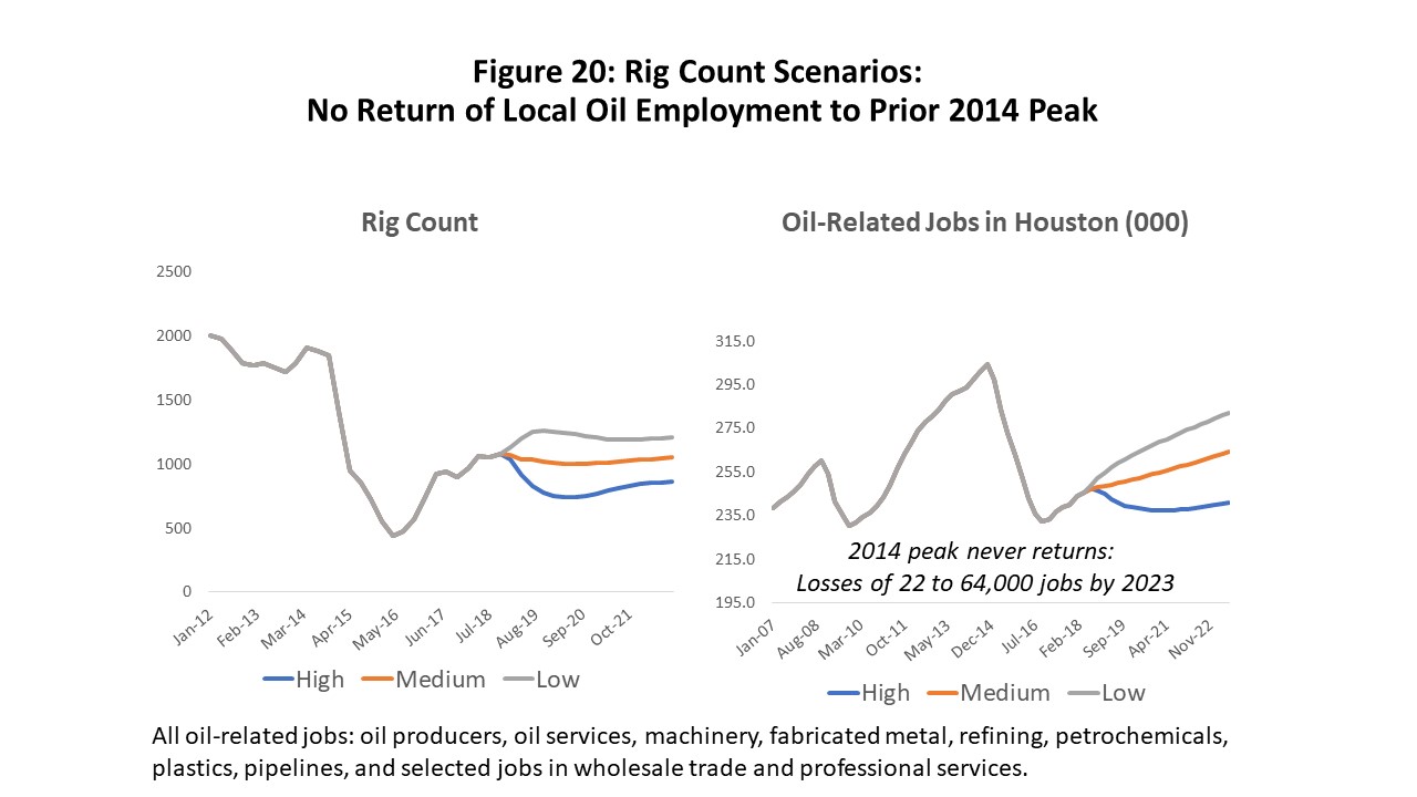
Without any guarantees on the price of oil, Figure 19 sets up three scenarios for forecasting oil prices and the Houston economic outlook. They are taken from tables of the relationship among oil prices, rig count, and Houston employment in Tables 9 to 12, and the low, medium and high scenarios are based on oil prices at $40, $60, and $80 per barrel. The high and low scenarios allow a short period of adjustment to the higher or lower price regime, followed by a long period of those prices simply continuing to prevail through 2023. Figure 20 shows the assumed behavior of both the rig count and oil-related employment through 2023.
The U.S. Economy Still Performing Well
The U.S. economy is presently in very great shape. It seems highly likely that 2019 will see the U.S. expansion pass the 10-year mark and become the longest period of sustained economic growth in U.S. history. There are longer-term risks ahead, however, chief among them being a possible clash between Federal Reserve monetary policy and the recent economic stimulus package.
The U.S expansion is robust with strength visible from virtually every economic measure. The probability of recession remains near zero; unemployment is at the lowest rate in five decades; job growth has been positive for 98 consecutive months; and the latest GDP reading stands at 3.5 percent in the third quarter. Our forecast assumes that the U.S. economy remains an important source of strength for Houston in 2019 and beyond.
Federal Reserve Policy has moved back to center stage now. The Fed has been tightening monetary policy steadily for nearly two years, and we will probably see another rate increase in December, with more to come in 2019. These rate increases are rapidly approaching the neutral point, i.e., the point where monetary policy neither stimulates nor restrains the economy.
- The current U.S. expansion began in 2009, and it began very slowly. By 2012 it had picked up the pace to return to moderate growth. Speculative excesses were largely wrung out of the cycle by the financial crisis, bringing a long period of stability.
- The Fed undertook unprecedented policy measures during the financial crisis, including a move to zero interest rates and a doubling of its balance sheet. In the last 24 months, the Fed has moved to normalize these measures, steadily withdrawing monetary stimulus.
- Through much of the recovery, the Fed repeatedly asked Congress to help speed the recovery with fiscal policy, e.g., tax cuts or infrastructure spending, but it got no response from Congress.
- We have recently seen inflation pick up and move back toward the Fed’s two percent target. Prices have accelerated before in this recovery, only to fall back. But will it be different this time, as we approach full employment and high levels of capacity utilization?
In December, Congress passed the Tax Cuts and Jobs Act (TCJA) that enacted much needed tax reform and lowered taxes for corporations and individuals. It did not raise taxes elsewhere or cut spending, however, leaving a $1.5 trillion-dollar deficit over 10 years. The Trump administration argues the tax reforms unleashed enough growth to pay for themselves; the nonpartisan Urban Institute says additional growth will only pay for about 13 percent of the deficit.
The TCJA was exactly what the Fed wanted five years ago, but not necessarily now. Faster growth potentially puts fiscal and monetary policy at cross purposes. If the labor market continues to tighten, the Fed may need to accelerate the pace of its rate increases. The use of monetary policy to choke back inflation can be a crude tool, and potentially puts the economy at risk if interest rates rise too quickly.
Figure 21 shows the standard measure of slack in the economy published by the Congressional Budget Office, including the long period of economic slack that followed the Great Recession. By late 2017, however, slack was gone and had moved into negative territory. This history shows a strong and negative inverse relationship between the amount of slack and rising prices. This is the Fed’s preferred measure of inflation, the real personal consumption expenditure deflator adjusted for food and energy costs. Over the last four quarters it has risen steadily and moved nearer the 2.0 percent target rate.
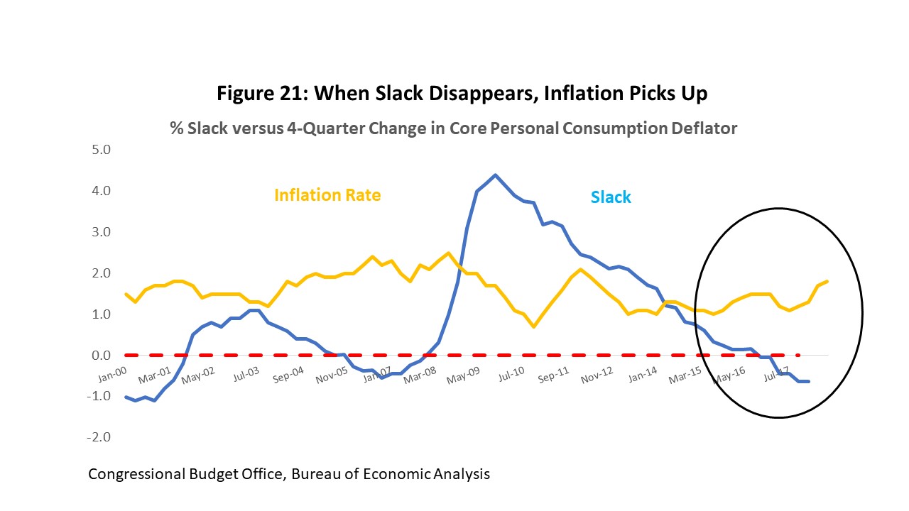
Figure 22 describes the probability of short-term interest rate increases using the Federal Funds futures market, i.e., a market for the Fed’s chief policy rate. With the right calculations, it can tell us the probability of a rate increase on a meeting-by-meeting basis through 2019. Despite much talk about the Fed moving more quickly, the Fed Funds futures market has been on the same path since before and after Janet Yellen was Chair, and before and after the tax cut bill. The projection throughout was that we would see three rate hikes in 2018; we have already had two and will almost certainly see the third in December.
Currently the Fed Funds market projects only one June increase in 2019, although at various times in recent months it has also indicated rate increases in March and December. The actual number remains data-dependent, but at the current pace and by the end 2019 we might be looking at a fed funds rate of 250 – 300 bp. This is near the neutral rate generally regarded as at where the Fed is no longer providing stimulus to the economy, allowing it to run on its own. But neither is it restraining the economy. The risk is that the pace of the rates must speed beyond neutral because of TCJA stimulus and inflation.
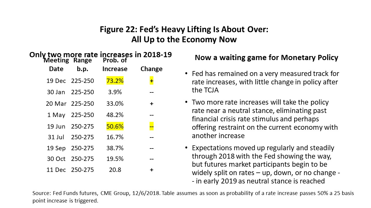
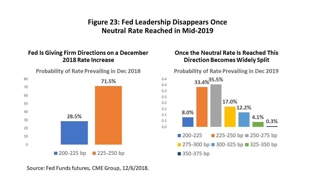
Fed leadership on rates has been strong to this point, but once we approach the neutral rate this leadership disappears. The Fed has more or less led the market by the nose from one small rate increase to the next through 2017 and 2018. The result has been a consensus built on slow but steady rate hikes. The upcoming December meeting is one more example, with a rate increase to 225-250 bp expected with a 70 percent probability.
But look at this time next year, as shown in Figure 23, after we have reached the neutral rate. By December 2019, rates are centered on 225-275 bp but spread from 200 to 375. Without Fed leadership any broad consensus among market participants is gone. It is clear that the Federal Reserve is also waiting for data but is as unsure about the future of rate increases as the rest of us.
After a decade of cheap money, a quick reminder about the return of market rates of interest might be useful. Money has not always been cheap, and it is good to understand how many different ways the current transition to higher rates can work out. Few of them involve a happy return to lower interest rates.
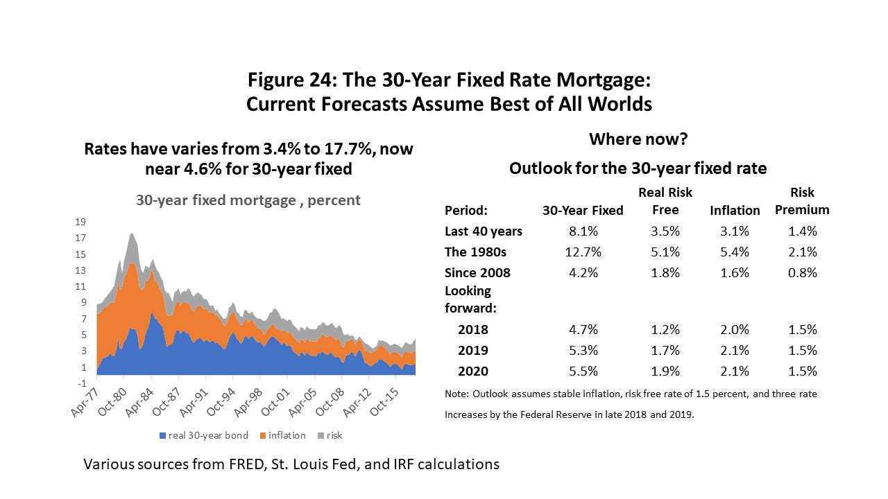
Let’s use the thirty-year fixed mortgage rate as an example. (Figure 24.) The rate can be broken into three parts: (1) a risk-free rate that reflects the time value of money and which is also the part that Fed policy affects immediately and directly; (2) a risk premium that can be fairly low since a mortgage comes with collateral; and (3) expected inflation that will be added onto interest rates within a matter of months.
We use a November forecast of mortgage rates from one of the big banks. I put the pieces together in Figure 24 before the most recent market turmoil, and they assume something of a perfect world: no increase in inflation risk beyond the target two percent, and as of November three rate increases from the Fed. The 2020 mortgage rate rises to 5.5%
What could go wrong? The history of the mortgage rates in Figure 24 speaks for itself in saying that perfect worlds rarely prevail. Suppose for example that inflation jumps to three percent, and the Fed responds with three more rate increases. Inflation passes through directly in a matter of months, as do the Fed increases, and the mortgage rate could quickly rise 7.75 percent in 2019. It would be a lot tougher to qualify home buyers if that should happen.
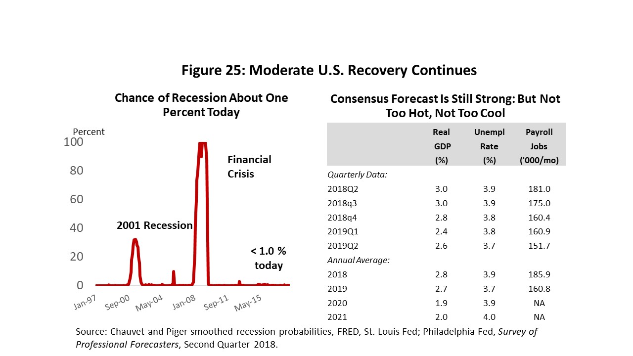
Our forecast for the U.S. economy assumes continued strength through the forecast horizon. On the left side of Figure 25 is a respected index of the probability of recession that tells us that the likelihood of being at or near a turning point in the current business cycle is less than 2% right now. There is nothing in the current outlook that remotely smells of near-term recession. On the right is the current forecast from the Philadelphia Fed’s Survey of Professional Forecasters. It implies moderate but healthy expansion. This Survey is adopted as our outlook for the U.S. and applied to the Houston forecast.
The Outlook for Houston
We have reached the point in the Houston business cycle where oil and the U.S. economy are the dominant actors. In 2015-17, we had help from continued momentum from the boom years, petrochemical construction, and Hurricane Harvey, but all of these one-time events are behind us now.
We assume continued moderate U.S. economic expansion. And we use three oil scenarios: high, medium, or low. High is based on a sustained $80 oil price, perhaps driven by major political disruption to oil markets; the medium forecast sees $60-$65 oil and drilling capped by OPEC quotas designed to limit both oil price and U.S. over-production; the low scenario might come about if OPEC again pulled out of markets as swing producer and triggered several years of $40 oil prices.
Figure 26 describes the outlook for Houston in terms of the increase in annual payroll employment. First, we take the temporary Harvey jobs out of the mix for 2017 because they are not built on economic fundamentals but a one-time event.
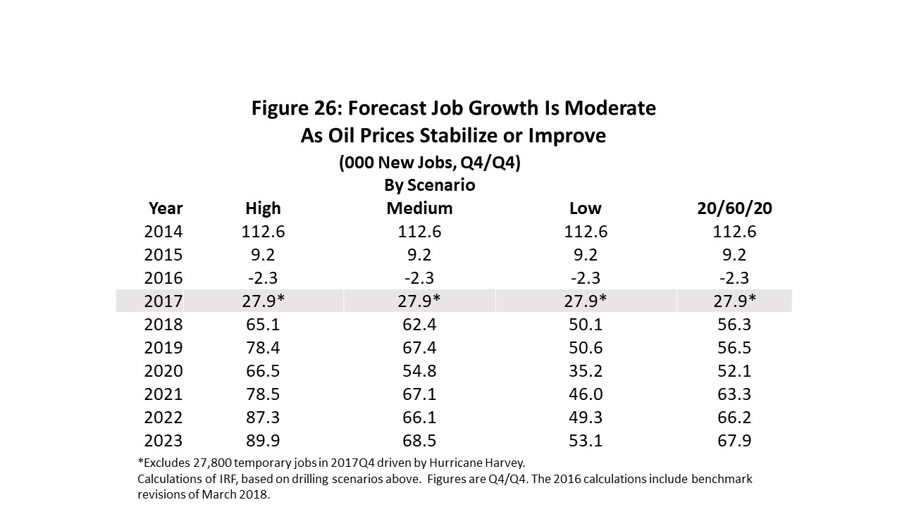
For the first time, we are explicitly using oil prices and the rig count as a key driver for the Houston economic forecasts. The medium forecast is explicitly built on $60-$65 oil and assumes that price level continues for the next several years. Combined with moderate U.S. growth, it brings us a steady 60-65,000 jobs. This is a two percent annual growth rate over the forecast horizon, or the average annual growth rate Houston has delivered since 1990.
The high forecast is for steady $80 oil and it brings around 80,000 new payroll jobs annually. The low is for $40 oil, but these low oil prices bring nothing like the setback of 2014. The recent fracking bust in Houston was based on $100 oil and the loss of 74,000 jobs. In contrast, this is a decline in oil prices from $60 to $40 per barrel, and so far, only 20,000 oil jobs have returned in this recovery. Lower oil prices now would not have the big negative impact of 2015-16.
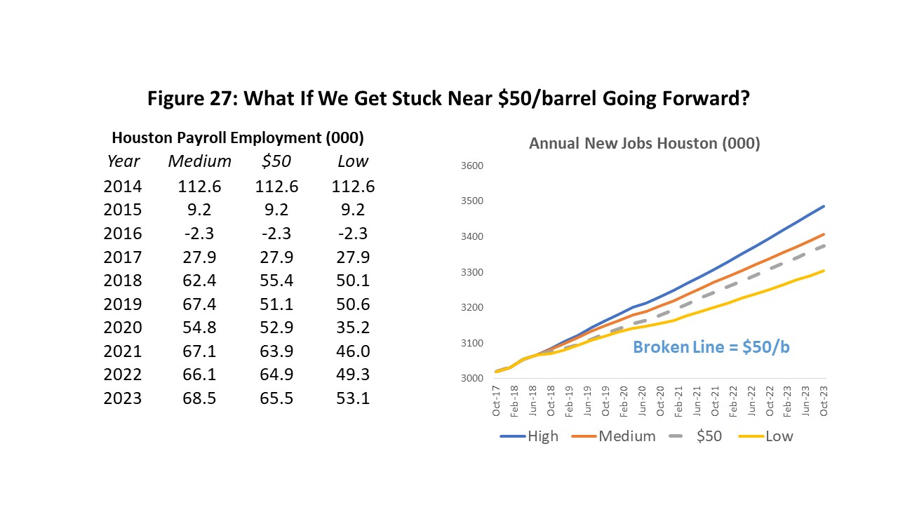
In the wake of the latest OPEC agreement in December, there is speculation that the cartel is seeking another approach to slowing American fracking. This so-called “third way” would involve pressuring oil prices such that they hover near $55-$60 per barrel for a prolonged period of time. With the cost of drilling and producing oil near $60, U.S. drilling would be forced to slow from current high rates. Figure 27 describes the result based on our forecast assumptions. In 2019 and 2020, in particular, job growth based on $50 oil slows by about 10,000 annually if compared to the medium forecast, although the difference shrinks substantially in 2021 and beyond.
Written by:
Robert W. Gilmer, Ph.D.
Institute for Regional Forecasting
December 11, 2018
1 I have used a fairly narrow definition of oil-related employment in Houston, because it gives us a clean comparison to the 1980’s and before the change in industry classification from SIC to NAICS. We use a broader definition in the forecast.
2 R.W. Gilmer, Institute for Regional Forecasting, Bauer College of Business, Harvey in Perspective: The Houston Economy and Hurricanes Past and Present, February 6, 2018 https://www.bauer.uh.edu/centers/irf/houston-updates-feb18.php
3 The data revisions by the Federal Reserve come as soon as the Quarterly Census of Employment and Wages is available from the Bureau of Labor Statistics. The data for the second quarter of 2018 were just made available in November. No adjustments beyond the initial sample will be made by the Texas Workforce Commission until early March of next year. For Dallas Fed adjustments see https://www.dallasfed.org/research/econdata/tx-emp.aspx#tab2
4 R.W. Gilmer, “Proximity Counts: How Houston Dominates the Oil Industry,” Forbes UH Energy Fellows Blog Post, https://www.forbes.com/sites/uhenergy/2018/08/22/proximity-counts-how-houston-dominates-the-oil-industry/#2a9baa9b6107
5 The model works well in terms of statistical fit and quality of tests. However, a key piece working as well as it does is that the price of oil was taken and known and given in the 2012-2018 analysis. Predicting oil prices would be the hard part of any forecast that involves a real look into the future.
6 See the recent survey of long-term prospects for oil demand by Michael C. Lynch, “The Oil Industry Revolution Will Not Be Televised,” Oil and Gas Journal, November 11, 2018 https://www.ogj.com/articles/print/volume-116/issue-11/general-interest/the-oil-industry-revolution-will-not-be-televised.html
7 An inversion of the yield curve is much cited in the current press as a signal that the Fed may have already gone too far in tightening, as some short-term rates already have risen above longer-term rates. The yield curve inversion has been a highly reliable indicator of recession in the past, but only when the yield on the ten-year treasury falls below the two-year. Other parts of the yield curve have inverted recently, but not this particular key measure.
8 Past forecasts directly linked an assumed rig count to local oil-related jobs, and oil jobs to overall growth. This forecast moves back one step, relating assumed oil and natural gas prices to the rig count, and then forward with linkage to local oil jobs and the overall economy.